MEDFAR, a leading provider of medical software, sought to modernize its brand identity to reflect its growth, innovation, and international expansion. The goal was to create a scalable and lasting visual identity that aligned with the company’s ambitious 2030 vision. The refreshed brand mark integrates the letters “M” and “E” to symbolize innovation, progress, and user-centered design, drawing inspiration from MEDFAR’s roots in aeronautical engineering.
As the lead brand designer on this project, I was responsible for designing the logo and brand gruidelines, as well as implementing the new brand across all company touchpoints, ensuring consistency in marketing materials, digital assets, and communications. The rebrand was officially launched at First Line in Health (Première ligne en santé), Canada’s largest bilingual healthcare conference, where it was introduced to over 1,700 industry professionals. The new identity strengthened MEDFAR’s position in the healthcare technology space, reinforcing its reputation as an industry leader.
Read more about the rebrand on medfar.com
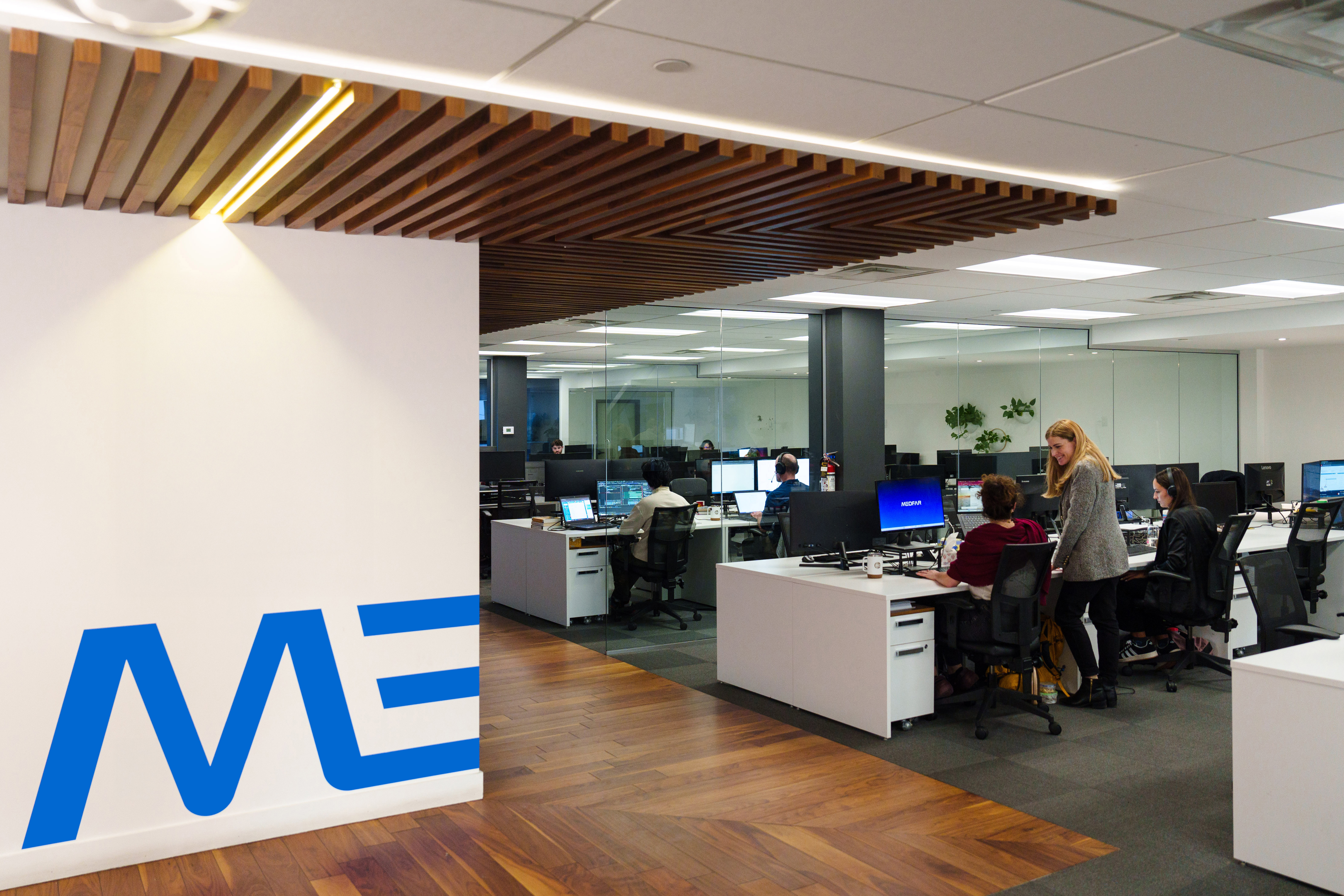
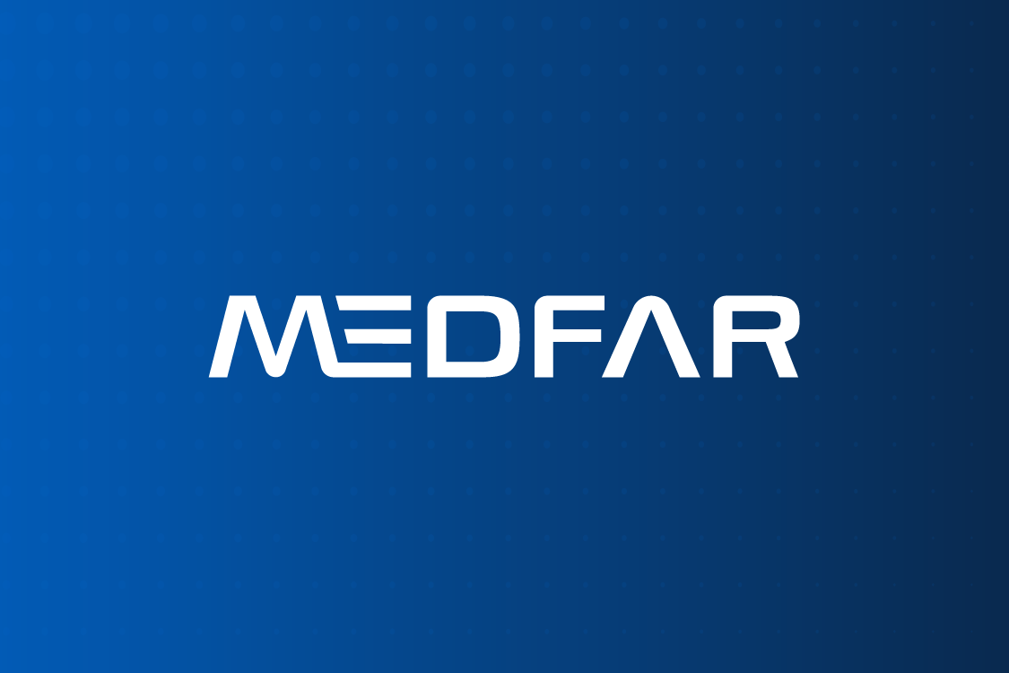
MEDFAR's new logo
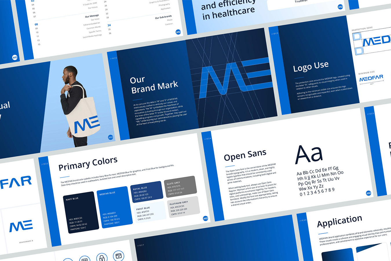
Guidelines for the application of the brand logo, colours, typography, icons, imagery and other graphic elements.
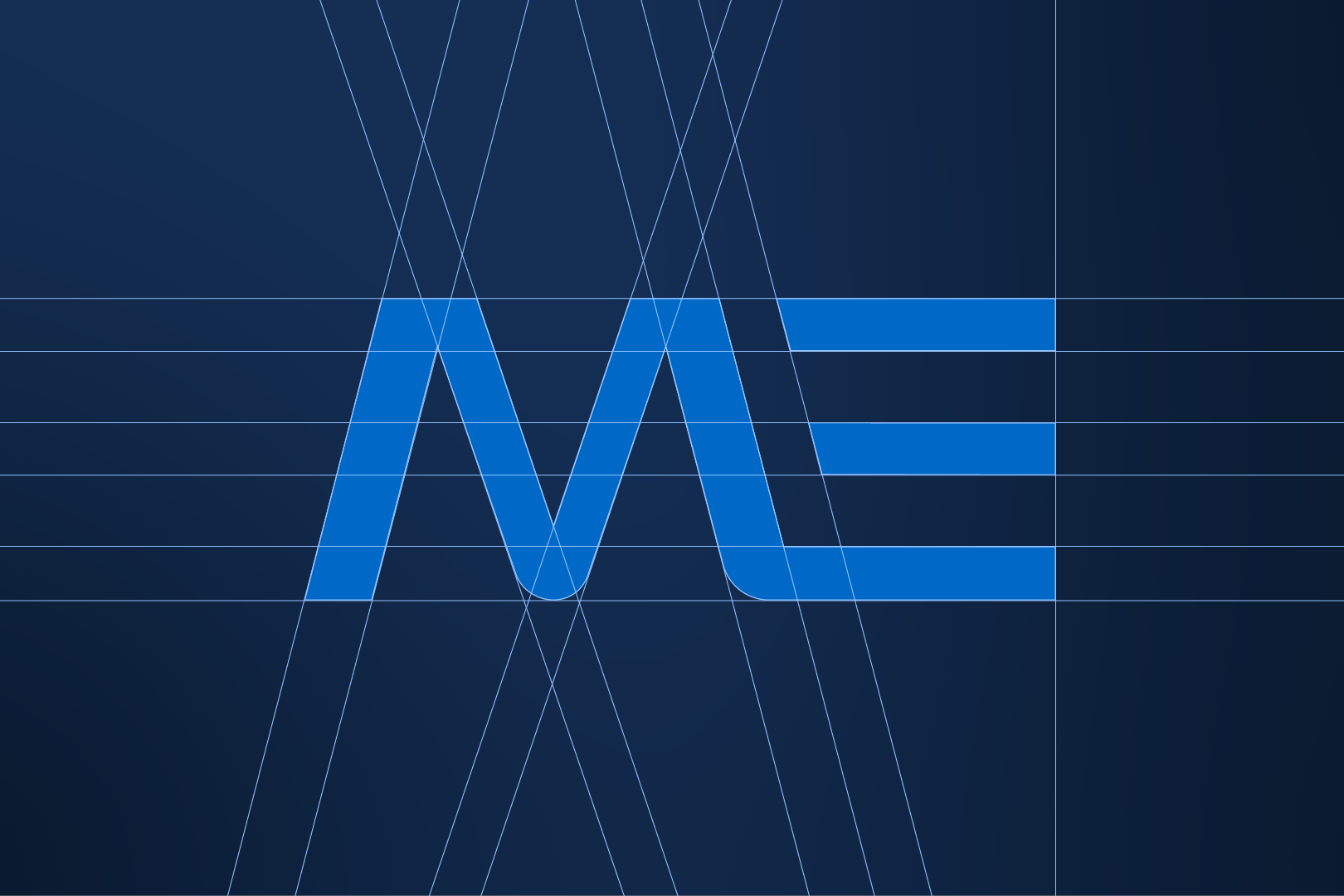
MEDFAR's brandmark, where the “M” symbolizes the heartbeat of innovation, and the lines of the letter “E” evoke forward motion, signalling progress and growth. Together, they spell out “ME,” underscoring the company's commitment to placing the user at the heart of everything they do.
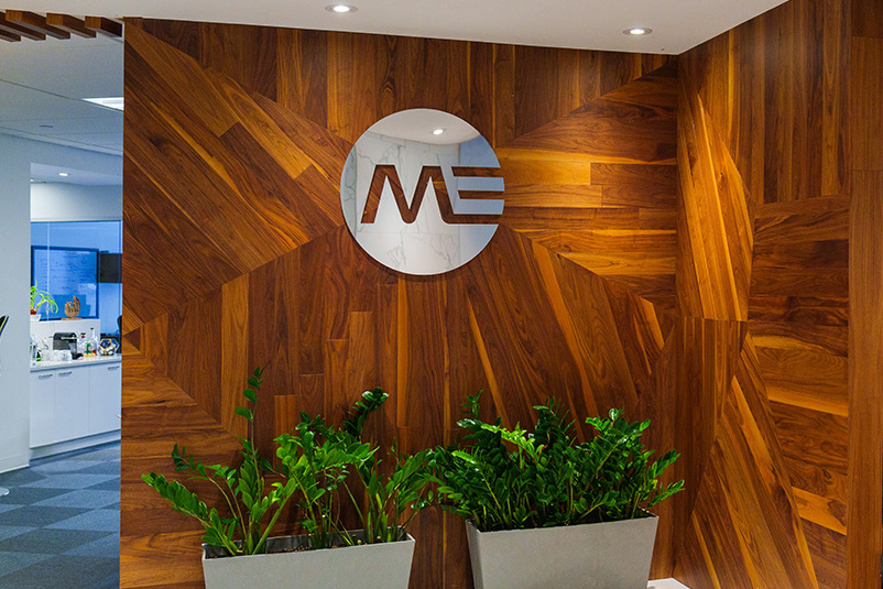
Sign in the entryway of MEDFAR's head office in Montreal.
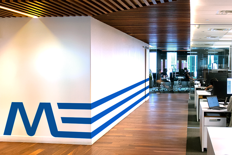
Integration of brand visuals in the head office hallway.
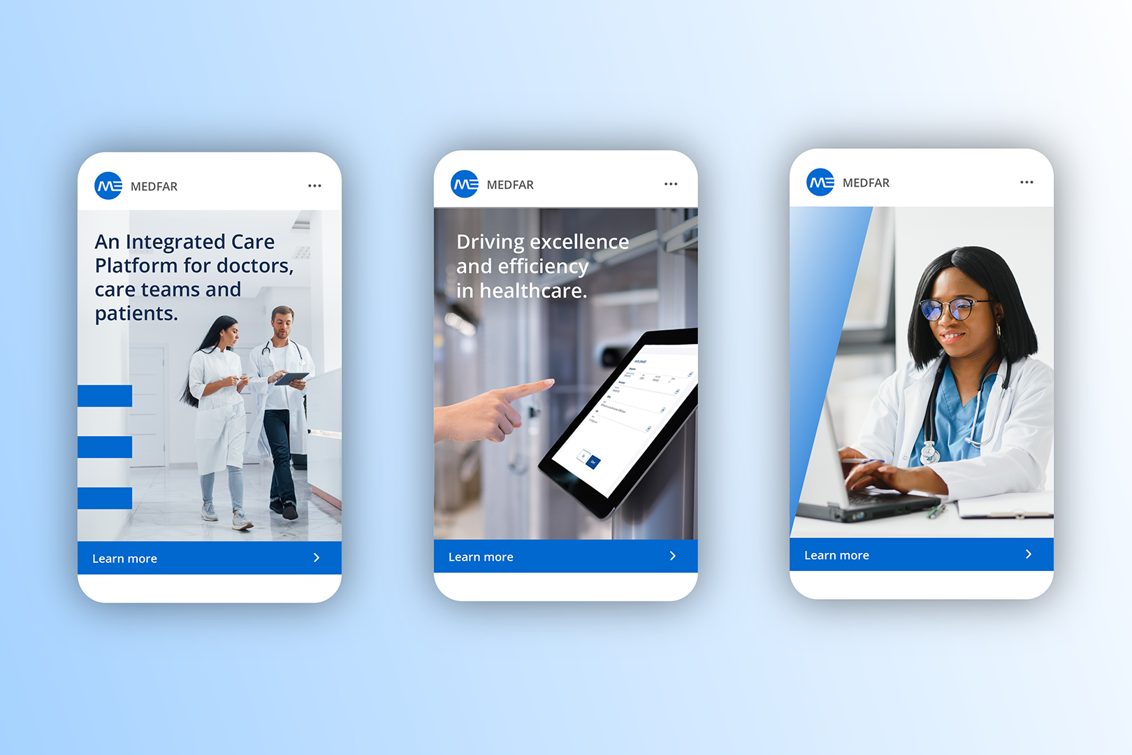
Digital advertisements for MYLE EMR, MEDFAR's flagship product.

Outdoor billboard advertisement.
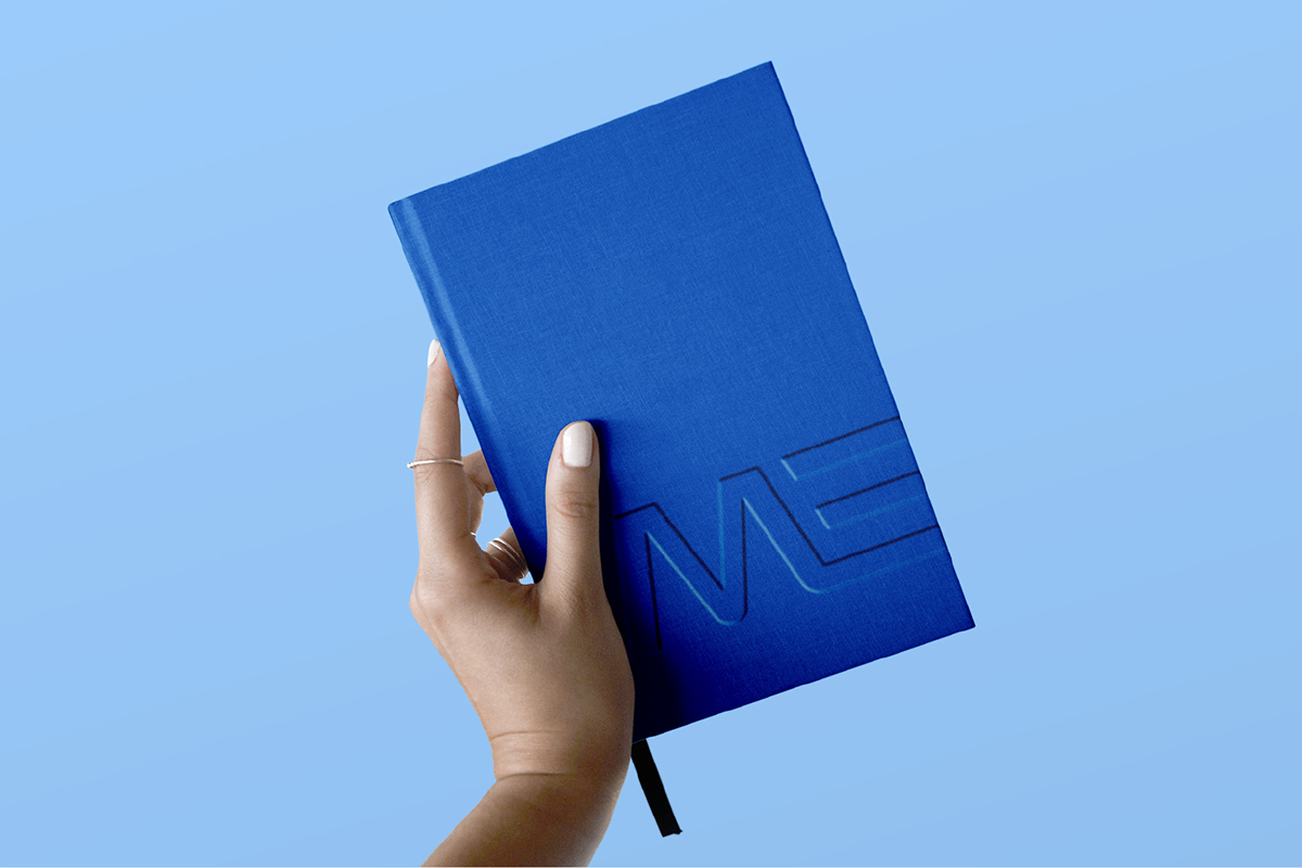
Embossed notebook with the MEDFAR brandmark, given to employees and prospective clients.

Custom tote bags made for employees to celebrate the rebrand launch.
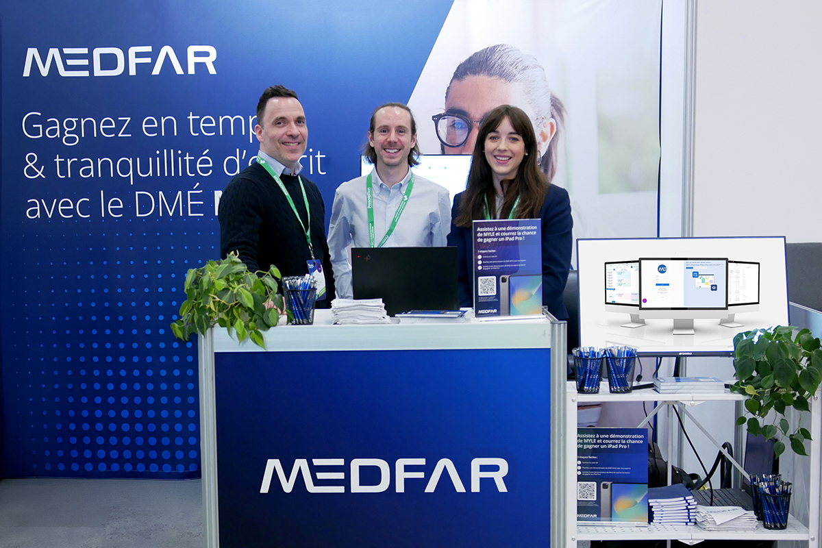
MEDFAR's trade show booth at First Line in Health Conference 2024.