During my time at with Synacor, a technology and services company based out of Buffalo New York, I had the opportunity to redesign the user interface of the backend push notification publishing tool for one of their new products. The product, Start App, was an app-based experience for access to a daily source of curated news and entertainment with a focus on short form video consumption on mobile devices. Synacor required a redesign of the application’s push notification publishing tool that would be used by developers to set up alerts through the app. The new design would need to be streamlined and intuitive, with each step clearly laid out so as to ensure optimal efficiency when used by the developers.
One of the issues with the previous design was that the distinction between sending out a notification versus sending out a test was not made very clear. The new design would need to include a clear system for this process to ensure no mistakes were made when sending out notifications. My role was to rethink this older design to make it more user-friendly and less susceptible to errors.
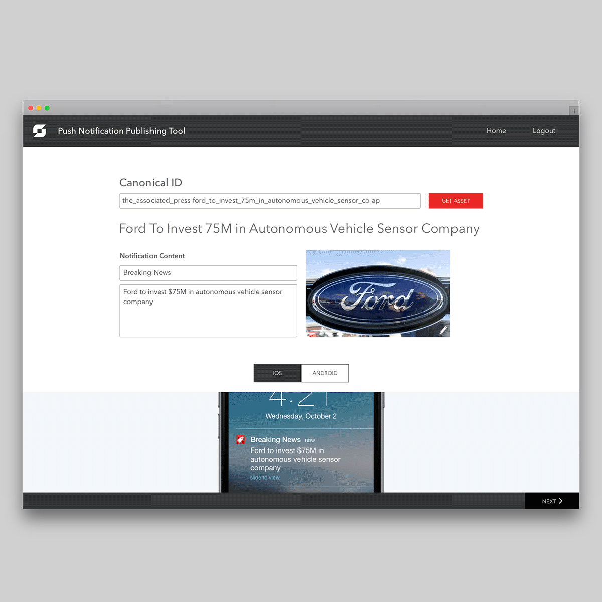
I took the Start App push notification publishing tool through the complete design process; from wireframes to the final prototype.
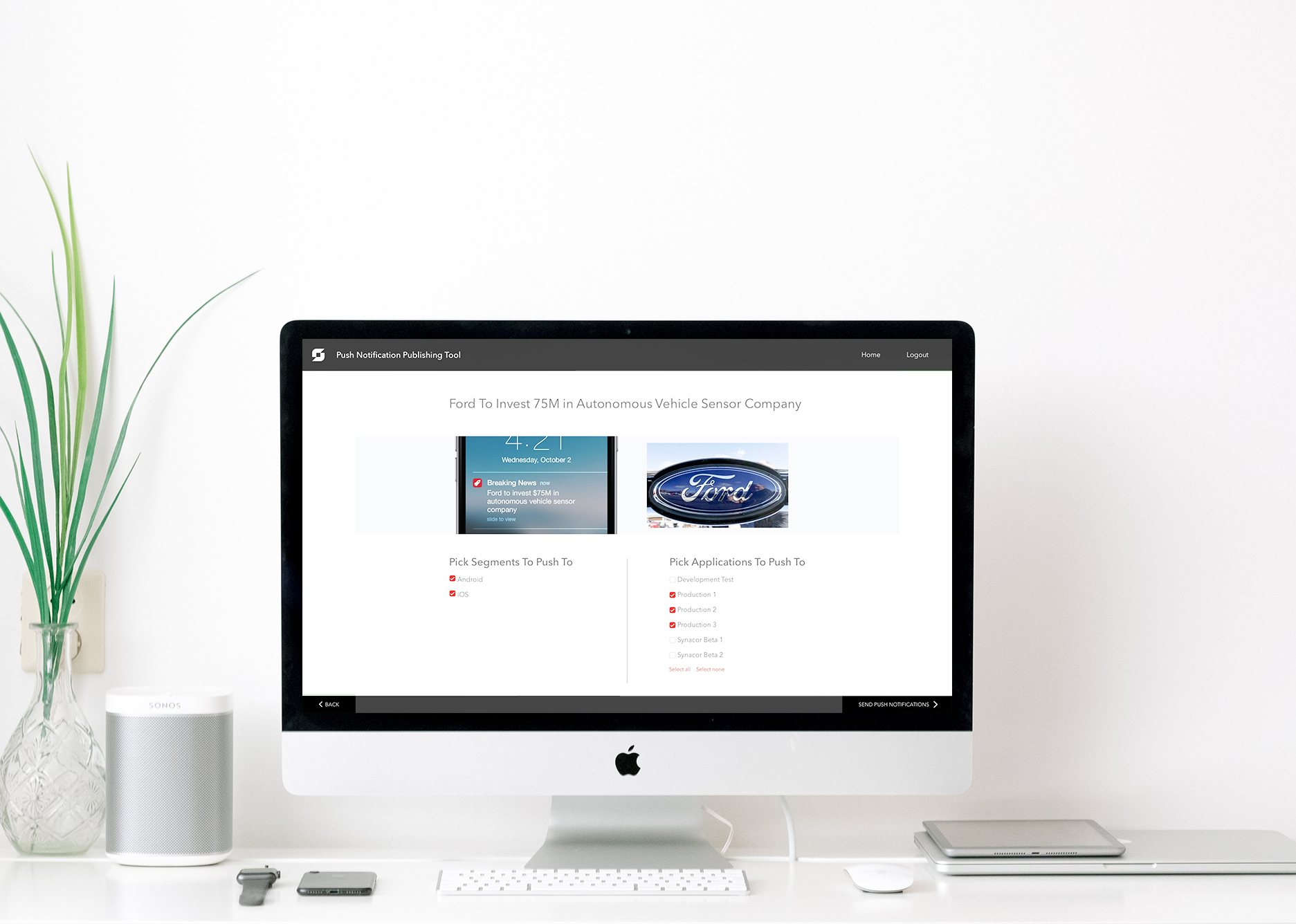
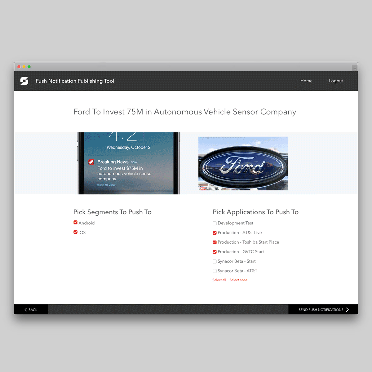
I increased efficiency by dividing the steps into separate pages and used bold colours as indicators of important interactive elements and text.
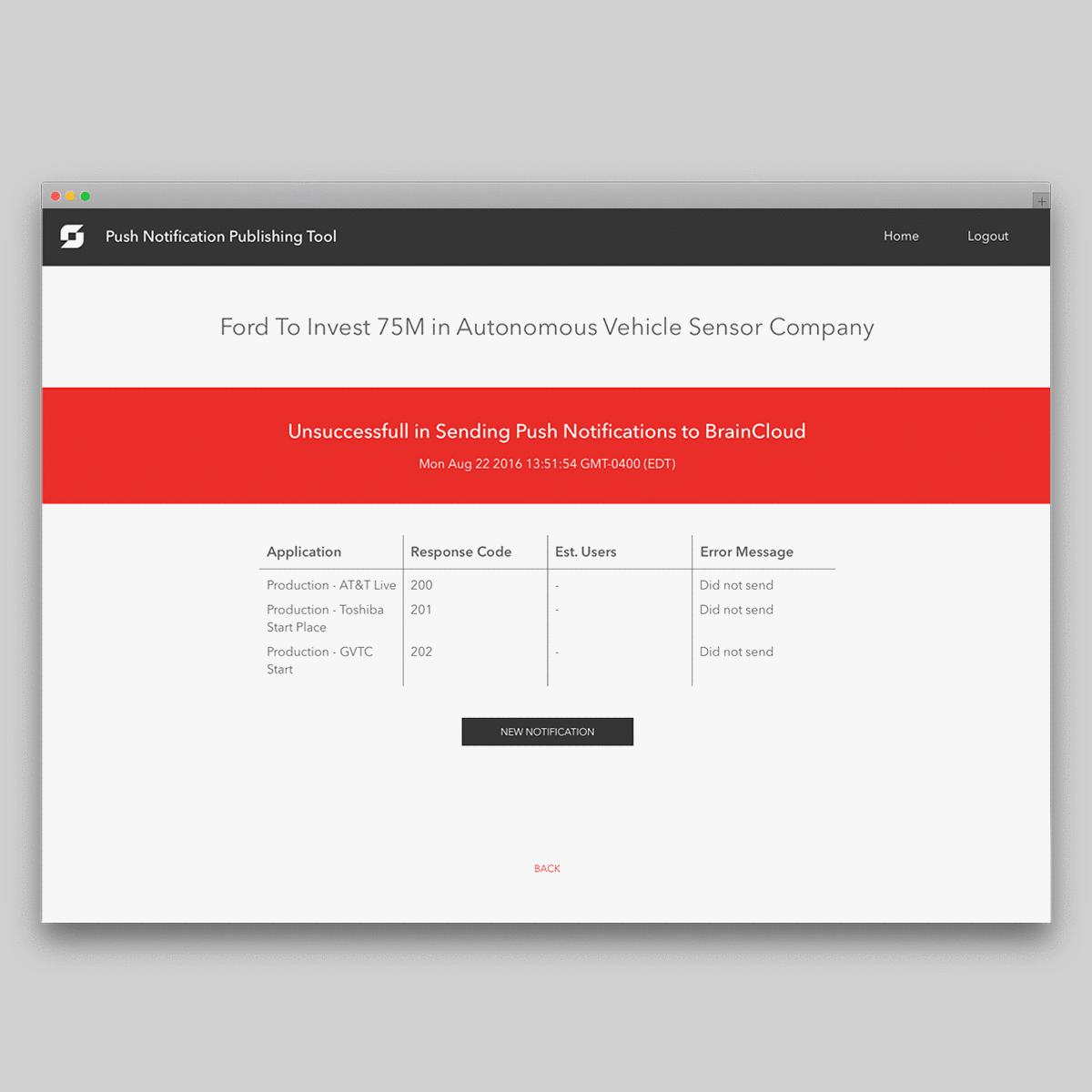
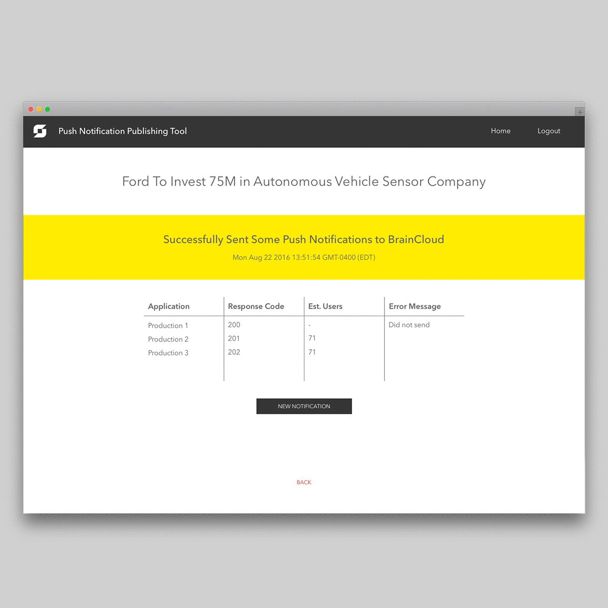
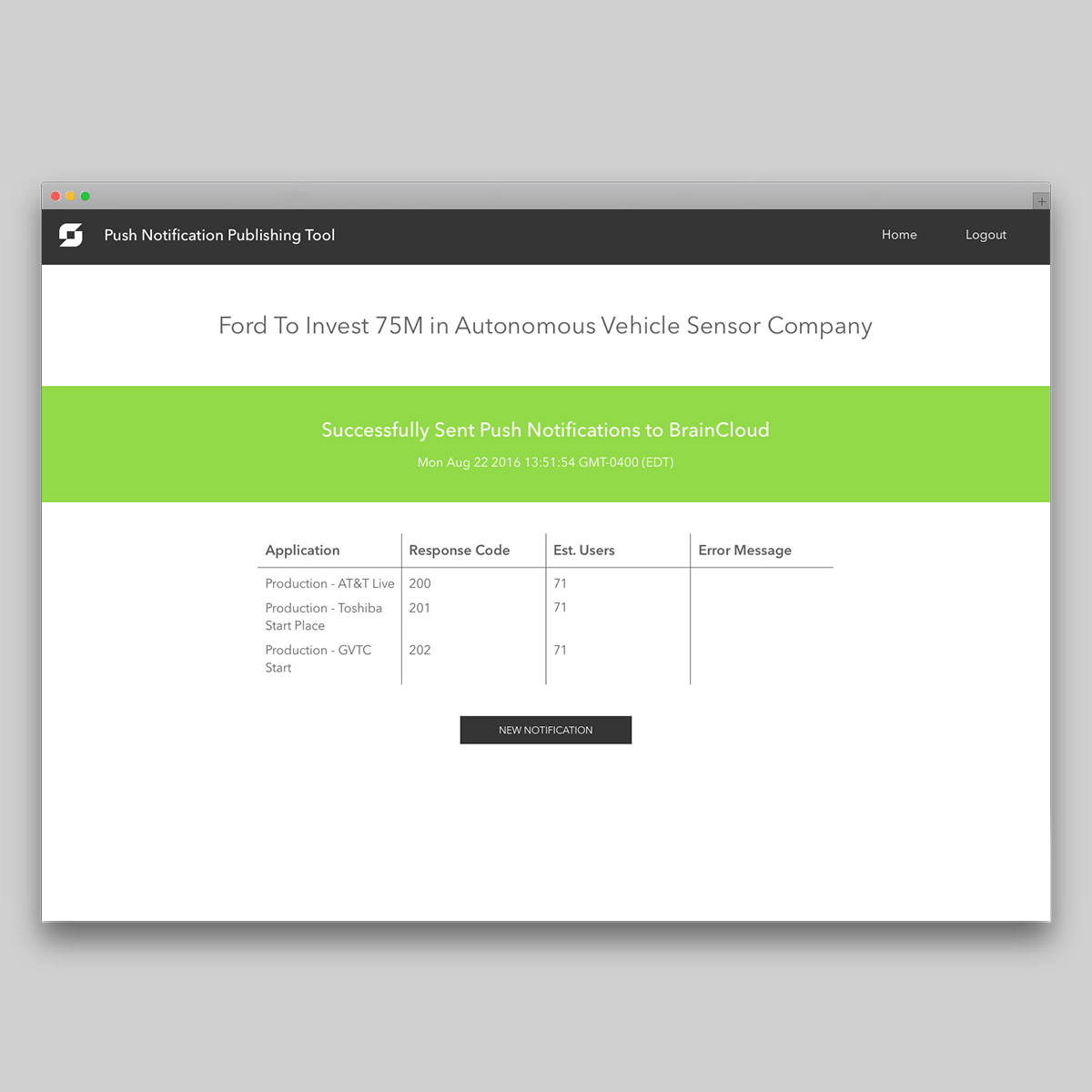
In the final screen, when the notification would be ready to send out, the user would see a colour coded message indicating whether or not the notification had been successfully deployed. These changes allowed the developers to move swiftly through the process of deploying a notification through the app with less margin for error.
The original design for the push notification publishing tool (pictured above) had everything on one page, resulting in certain steps getting missed or overlooked.
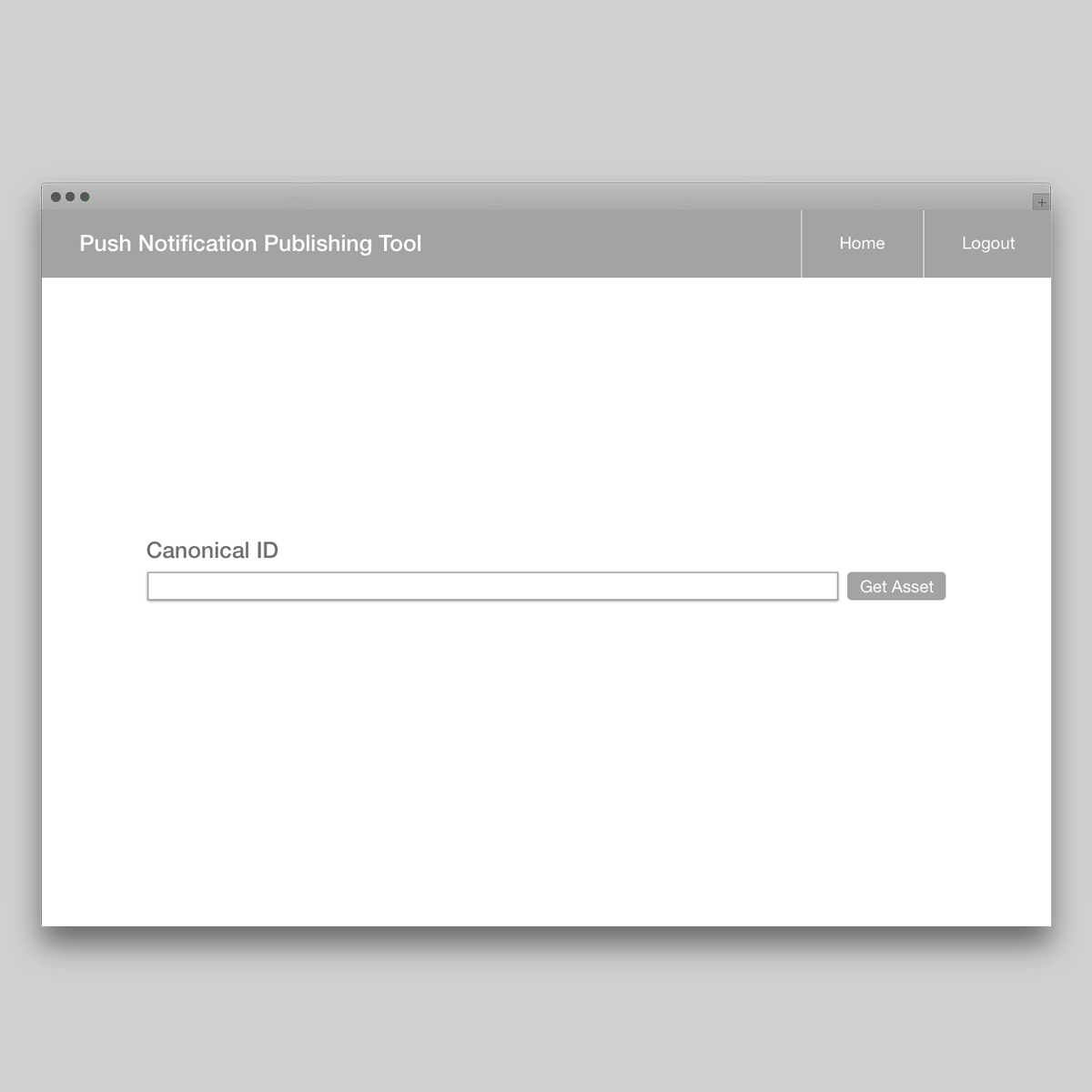
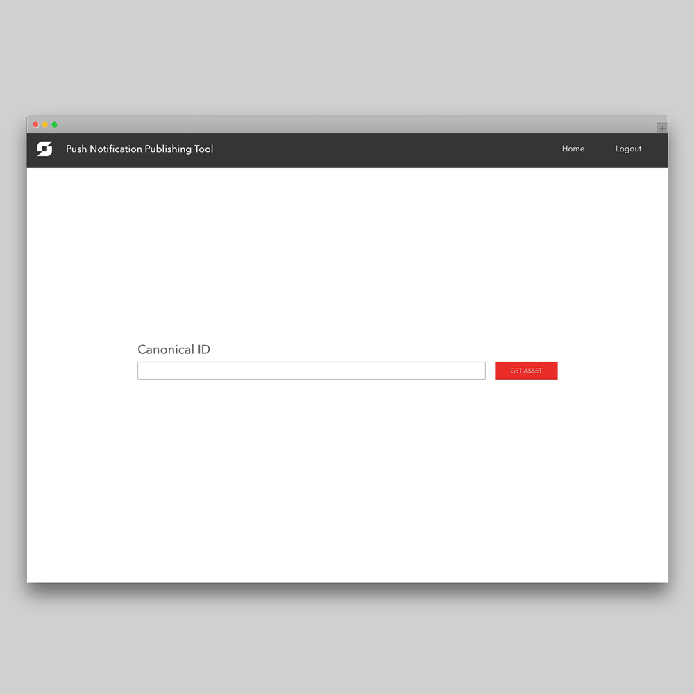
I designed wireframes for the push notification publishing tool to test out the new improved user flow.
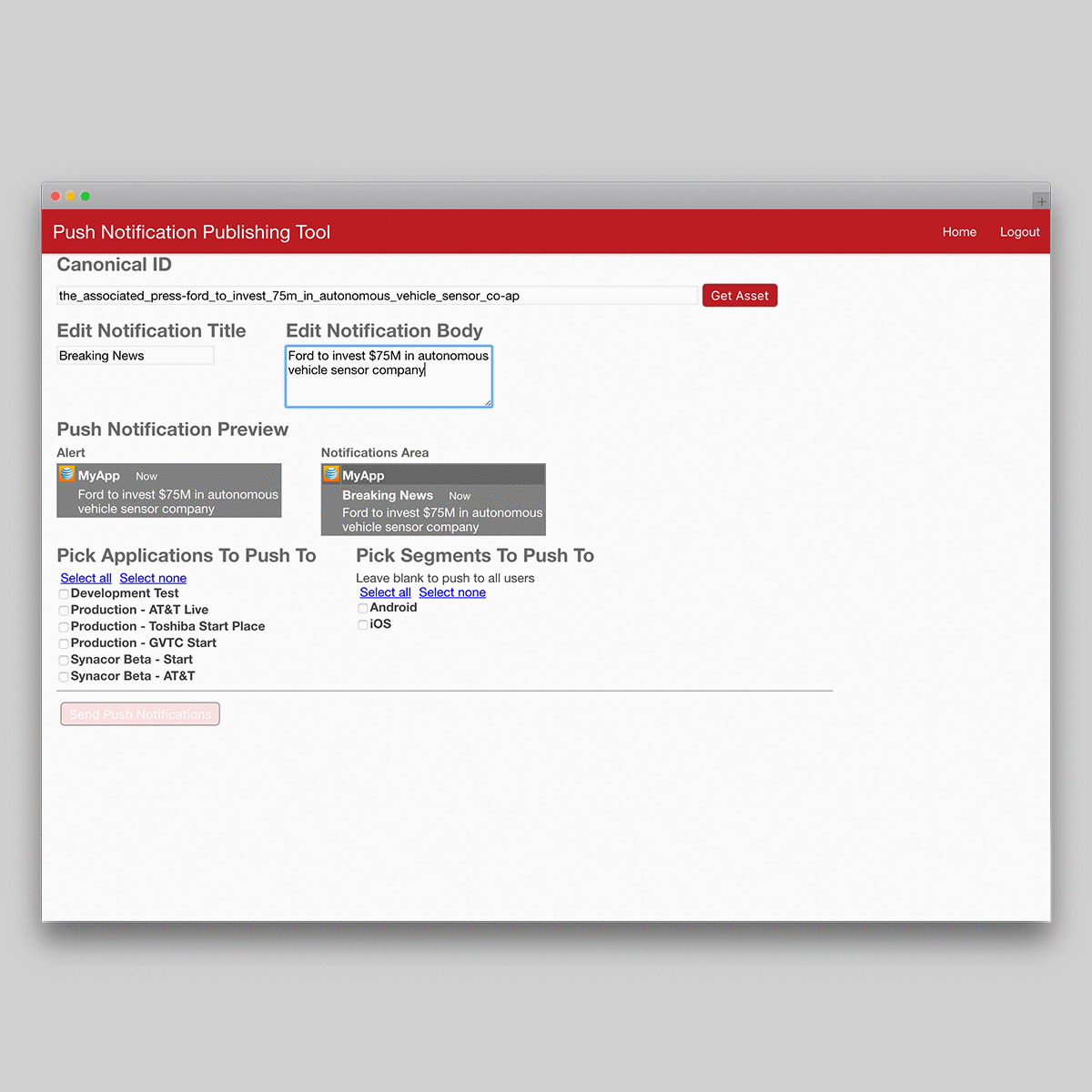
The new design would include the option to preview notifications as they would appear on both Android and IOS.
A step was introduce to easily send the notification for either testing or production.
Using bold colour indicators on the final screen made it clear to developers whether or not the notification had deployed successfully.