The Ontario Professional Hairstylist Association (OPHA) sought to refresh their brand image to better reflect their professional identity. The goal was to create a modernized look that would increase brand recognition and align more closely with their role as a leading industry association. The updated logo, along with a refined color palette and font choices, helped elevate OPHA’s visual identity, presenting a more professional and contemporary image that resonated with both current and future members.
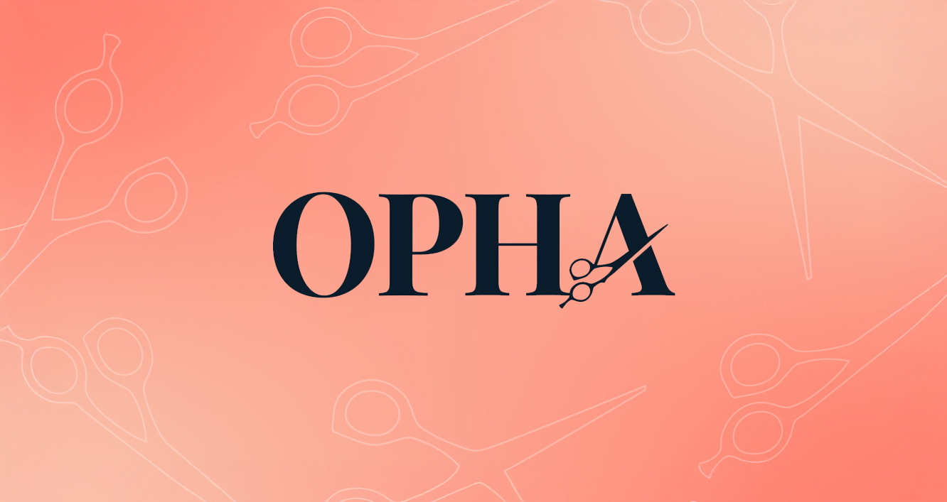
Updated logo with bold typography, optimized for legibility.
Logo minimum-spacing from the updated brand guide.
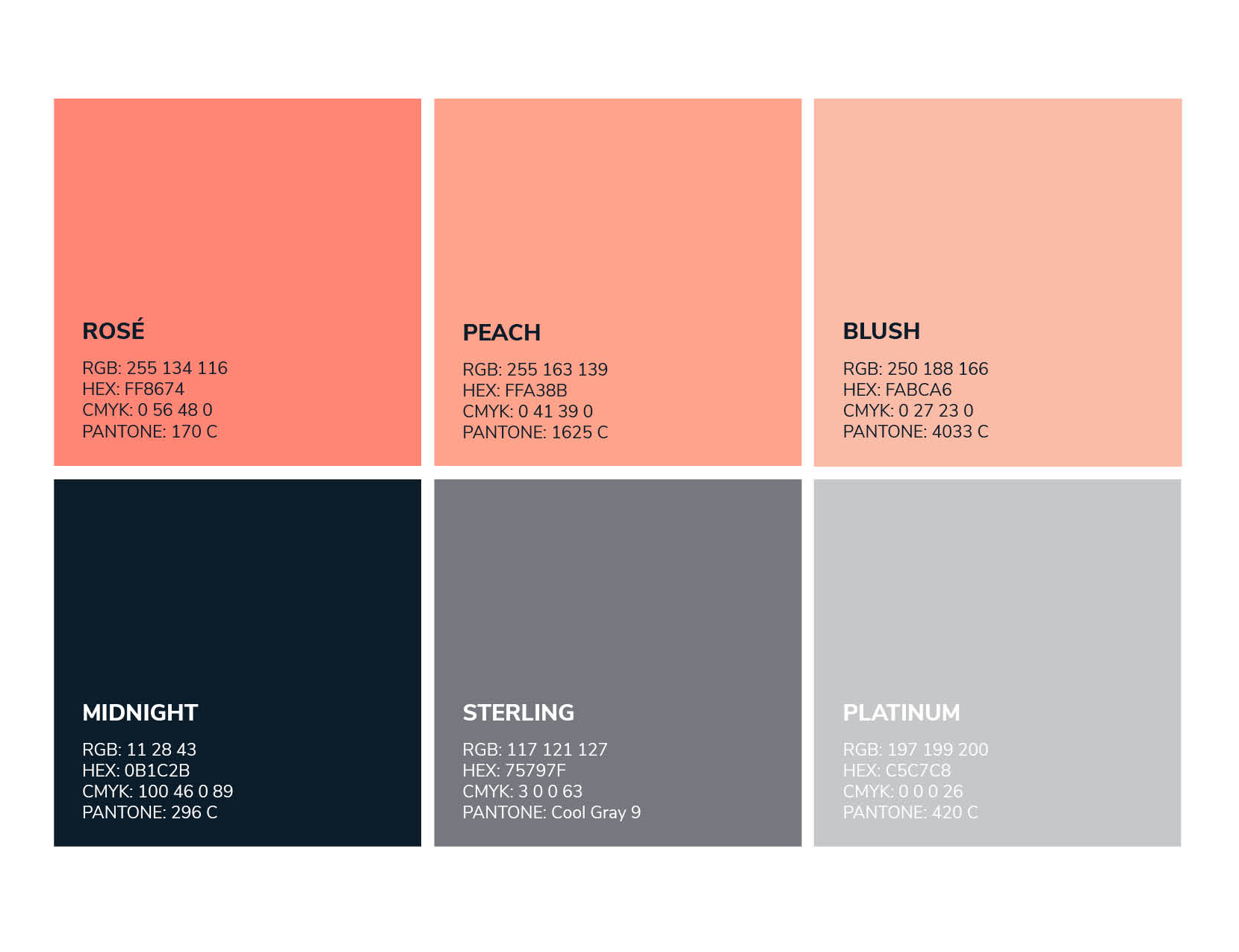
Vibrant new colour palette.
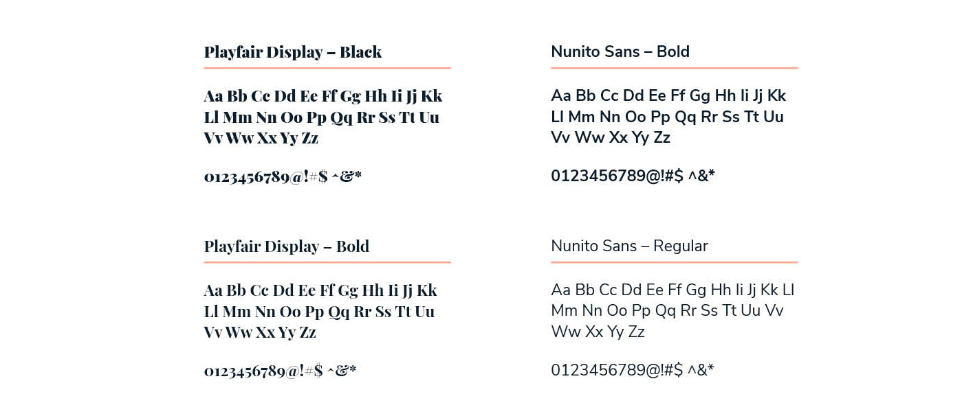
Modernized font selection.
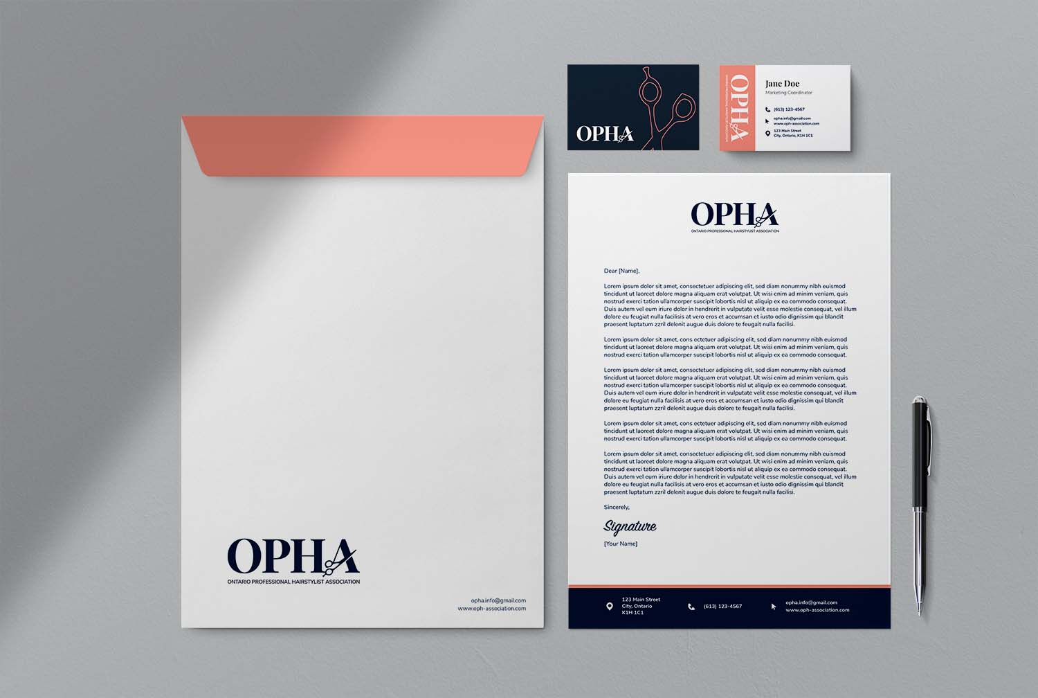
Branded stationary with bold pops of colour.

Social media posts with new brand imagery.